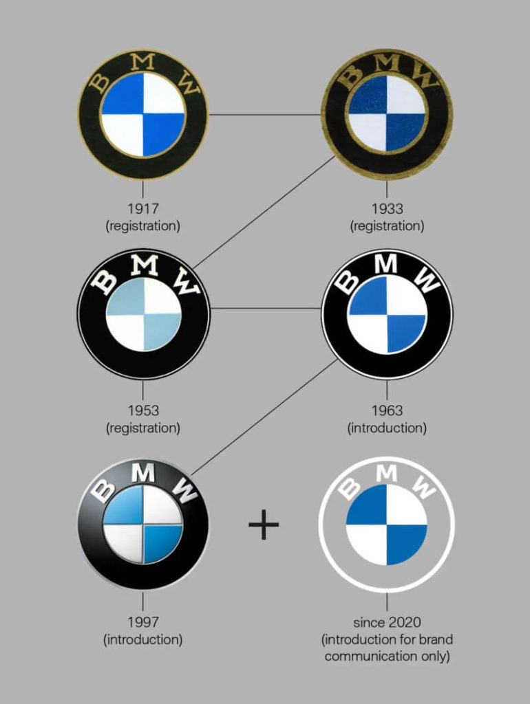
Have you seen the new BMW logo? If you haven’t yet, it’s likely you’ve read about it. It was a seemingly random move on the international company’s part. This is because BMW first introduced its logo in 1917 and there hasn’t been much change in it since. In 1997 they added small updates to the overall look such as a 3D effect and shading. That means the logo hasn’t been touched in over two decades. Dedicated BMW followers have already come out against this new, modern design. Are we just afraid of change or is the new BMW logo that bad? Keep reading on to find out more.
The New BMW Logo Leaves Behind Its Brand Identity
As a Marketing Agency, we’re always interested in logo design and especially logo redesign. Therefore, when the new BMW logo came out, we were a bit shocked, to say the least. Without an update over the past two decades, it’s completely fair that BMW wants to redesign its logo. However, the abrupt deviation from their traditional look since their inception in 1917 caught most people off guard. It’s clear the logo design trend right now revolves around flat, minimalistic designs. While the new logo does reflect this trend, it jumps too far ahead.
When you look at the new logo for BMW compared to the last update in 1997, you’ll notice they’ve flattened the design by removing the 3D elements and shading. This is something that our marketing agency likes and appreciates. It does make the logo look more contemporary. However, they messed up by removing the iconic black ring in favor of a transparent design. The 2020 BMW logo is very reminiscent of their 1963, though something is missing.
There are a couple of problems with these changes. The first is the logo has now become hard to see. With its white outer ring and white font, unless it’s on a dark background, it’s likely to just blend in. This will pose a problem on letterheads or if the company decides to use it on cars (a white car, for example). The second and much larger issue is that BMW is losing some of its well-deserved brand identity. The BMW logo is very distinctive. Even from far away, if you saw the black circle with white lettering, you could be sure it was a BMW logo. With that tell-tale black ring missing, it’s hard to distinguish it from many other bland logos.

Your Brand, your Logo Design, is Essential for Your Business
What’s the lesson here? Change isn’t always good if it’s not in the right direction. BMW could have easily released a modern version of their 1963 logo as a throwback. However, their leap into the modern era of digital logo design has left their loyal followers baffled. The uproar from the car community and BMW fans have proven one thing though. Logo design is essential for your business. Whether you’re creating a new brand logo or looking to refresh your current one, hire a Marketing Agency that you can trust. An experienced Marketing Agency can help you find the important balance between a contemporary style with a traditional concept that has been proven to work.
MKTDIRECTOR has been featured as a top marketing agency here and here. It has also been featured as one of the Top Branding Agencies of 2020 according to DesignRush.